Expert review: How do we adapt Heuristic Evaluation to review Cartesi website?

What is Expert Review?
An expert review is a usability evaluation method based on Jakob Nielsen’s Heuristic Evaluation, where experts assess an interface against a set of usability principles. Traditionally, this method uses Nielsen Norman Group’s 10 heuristics.
However, because Cartesi.io is a Web3 website, we adapted the review to go beyond the classical heuristics.
How do I approach the expert review?
Step 1: Set the scope
I started by identifying two primary user personas:
Web3 developer
Crypto investor
For each persona, I created a set of task scenarios that cover their fundamental journey on the Cartesi website. These task scenarios were shared with evaluators in a Word document. We also clarified expectations: evaluators would submit findings in a Google Slides format, with screenshots, annotations, and clear explanations.
Step 2: Individual evaluation, no groupthink
3 evaluators participated:
Myself (UX researcher)
A product designer (internal teammate)
An external UX researcher (for unbiased input)
Each evaluator reviewed the site independently to minimize groupthink and ensure a broader range of findings.
Step 3: Consolidate identified issues
Once all evaluations were complete, I compiled the insights into a master report. Each issue was tagged with:
A severity rating
Suggested design recommendations
This allowed the team to prioritize issues during the website redesign phase.
Key learnings
Below I will highlight some issues with high severity and recommendation.
#1 Confusing Call To Action (CTA) button as an anchor link
CTA’s major goal is to induce people to take certain actions that present a conversion for a particular page or screen. Anchor links are typically used to as a back to top link or skip to content link. There are 2 CTA buttons on Cartesi Cartesi websites that are functioned as anchor buttons, which is unusual.
This behavior is present in:
“Start Building" CTA button - Navigation menu and homepage
“Apply for grants”, “Stake CTSI” - Governance & Grants Overview page
Recommendation: Do not user CTA button as anchor link. Use anchor links in appropriate context, for example content navigation.
#2 complex, oversized background
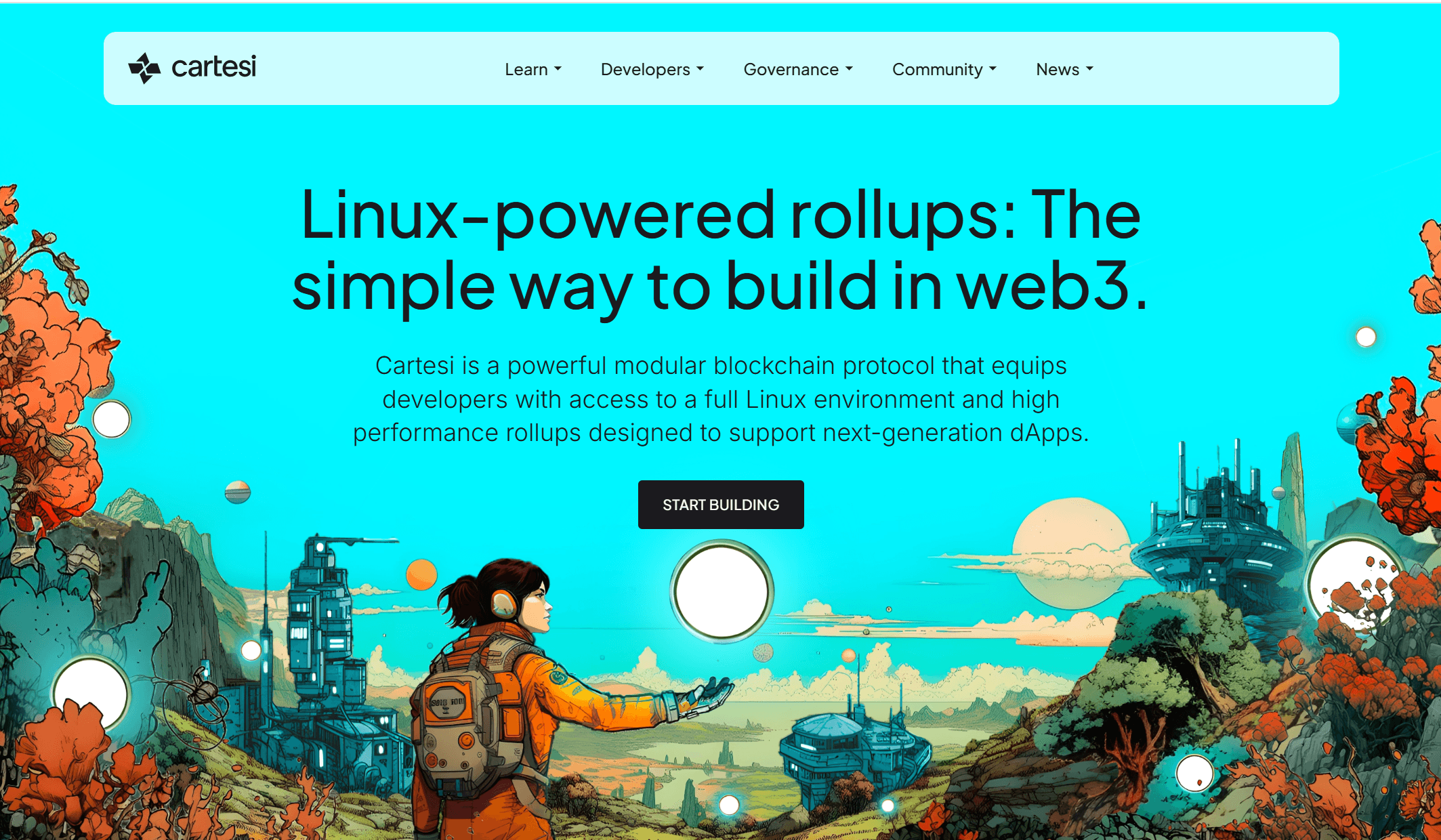
Users generally don’t scroll much. The oversized background will result in excessive scrolling and users might missed the important information.
The complex visual on the other hand and low contrast between text and background make important information hard to read.
Recommendation: Reduce the size of the hero image. Consider using high-contrast text and simple background colours to improve the text legibility.
#3 Inconsistent behaviour of in-page link
On the About page, the in-page link "Read the Thesis" directs users to a blog page without opening a new tab. This is inconsistent with the similar elements on other pages, such as the homepage and the Governance & Grants Overview page, consistently open in a new tab.
Recommendation: Use consistent configuration for the in-page link.
#4 Unclear navigation label
The main navigation menu lists the Rollup lab under "Build with Cartesi." This label can be misleading for users as it does not clearly indicate that it leads to the "Rollup lab."
Recommendation: Use clear and descriptive labels, such as “Rollup Lab” and “Use Cases” to ensure users can easily find projects built on Cartesi. The label should be easy to learn and recognize on subsequent visits.
#5 Missing information
Some key information is missing from the website, making it harder for users to fully understand Cartesi governance and grants.
Cartesi governance mechanism
How to vote and participate in governance voting
Staking overview
Cartesi grant overview
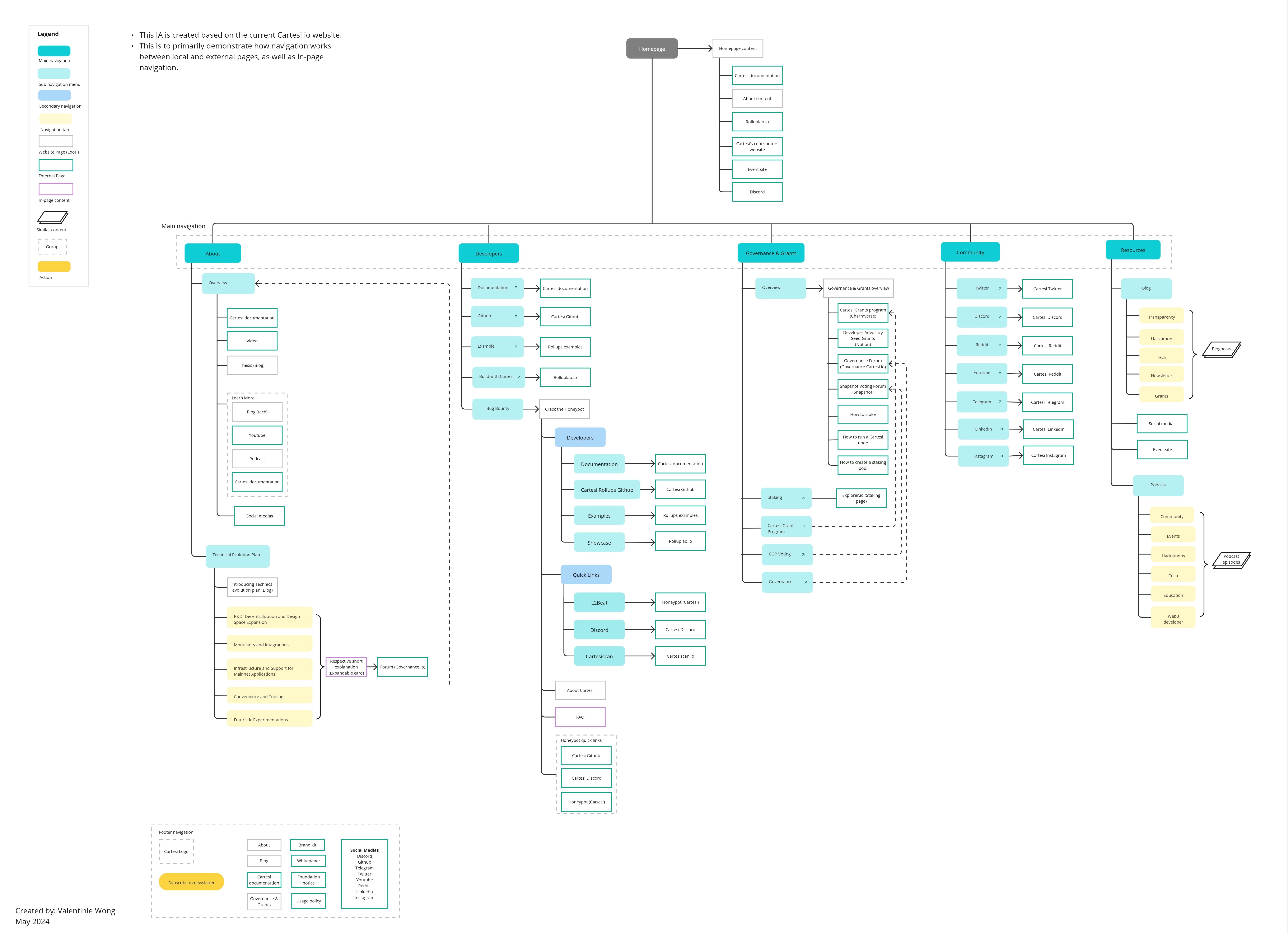
Mapping the Current Information Architecture
To help the team understand why users were struggling with navigation, I created a detailed map of the existing information architecture (IA). This map became a discussion tool, helping the design and content teams see where things were falling short and what to fix next.
Impact
Following the redesign, Cartesi.io saw exponential user growth in Q4 2024, especially during Devcon and ETH Global in November.
The expert review report became a go-to document for design decisions.
The information architecture helped the team resolve navigation pain points.
I also learnt and use Looker Studio to make performance dashboards more accessible.